



Art Direction: Amber Armitage
Photography: by Melanie Jenkins
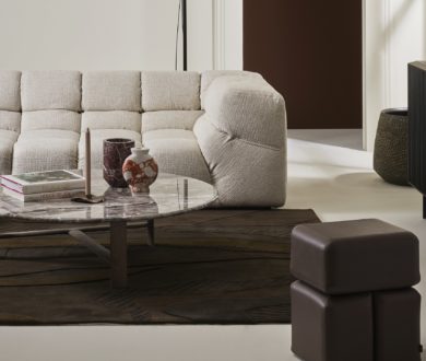
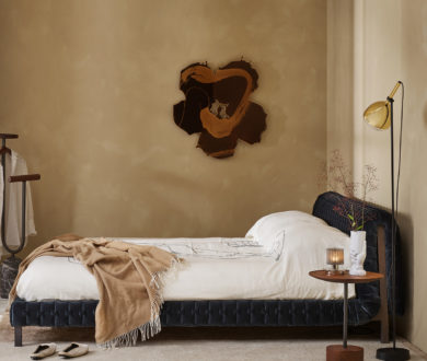
Yellow is making its way back into our most design-led spaces, bringing warmth, optimism and a welcome sense of lightness. Here, the experts at Resene show us how to embrace the season’s most uplifting shades. Moving beyond bright, statement-making shades, this season’s take is softer and more refined, with buttery neutrals, honeyed tones and warm amber hues creating spaces that feel calm, inviting and easy to live with. Here, Resene Buttermilk forms the foundation of the scheme, bringing gentle warmth to the walls while remaining neutral enough to work throughout the room. On the ceiling and door, Resene Manuka Honey introduces greater depth.

Using the richer shade overhead is an unexpected choice, but one that makes the room feel more intimate while drawing the palette together. Underfoot, Resene Half Milk Punch in durable Resene Walk-On keeps the floor light and provides a simple base for the room’s natural materials and textures. A timber sideboard, travertine side table and putty-toned bouclé add interest without competing with the surrounding colour. The success of the scheme lies in its subtle variation. Each shade belongs to the same warm family, but offers enough tonal difference to give the room definition. Used from ceiling to floor, the colours create a space that feels considered, comfortable and quietly uplifting, proof that yellow can be both playful and sophisticated.