As founding partner and creative director of Inhouse; an Auckland-based boutique graphic design studio established in 1995, Arch MacDonnell is regarded as one of the foremost figures in his field, thanks largely to his lofty collection of awards. Continually recognised both locally and internationally for his work, MacDonnell has served as a judge at the Cannes Lions International Festival of Creativity, and has had his work exhibited at San Francisco’s prestigious Museum of Modern Art.
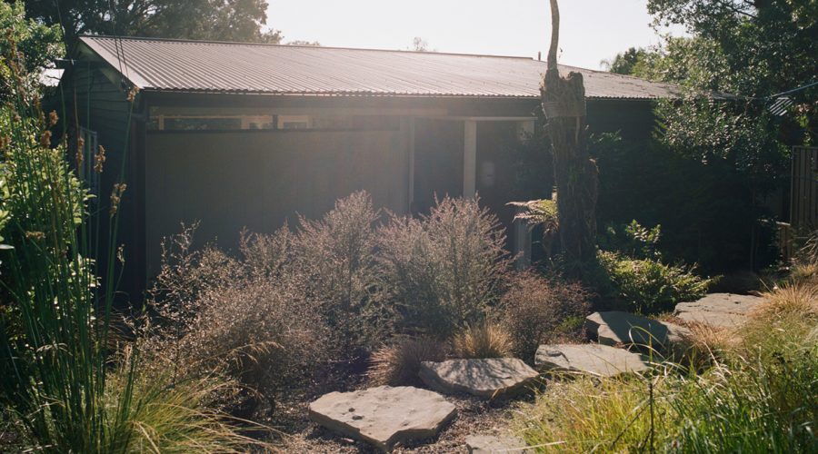
After 20 years of operating from Auckland’s CBD, MacDonnell set up shop in what he describes as a mid-century modern tramping hut. Renovated to his exacting standards and nestled deep within the bush of Birkenhead, with daily visits from neighbourhood kererū, the tranquillity he says, is the panacea to a working life of short-lead stressful deadlines. Here MacDonnell shares insights, observations and enthusiasms from the last twenty-five years of practice.
1. Good work begets good work
We worked with Pip Cheshire a long time back when it was just Jane (my wife) and I, and he was still part of Jasmax, I remember him casually saying that ‘good work begets good work’. Not a difficult concept to grasp by any means but it had a particular resonance. It was like a little finger in the ribs, probably because we were doing a fair bit of horrible commercial work at that time. I knew he was right, and it was a catalyst for us ditching some clients. Whilst financially risky, it allowed us to focus on the creative work. We had to cut down on paninis and bowl lattés (it was the 90s) but we got to work on the NEW Gallery’s identity.
This work led to more projects with Auckland Art Gallery, dealer galleries and artist monographs. We’ve seen this play out in other fields also, working with the New Zealand Institute of Architects for many years led to opportunities to work with individual architecture practices. Having early success in wine label design means we have a winery client in the mix more often than not. So there was a second lesson — be brave enough to turn work down. While good work begets good work, mediocre work will also attract more of the same.
2. Build a team
My dad would always say, ‘hire the best people, and the rest takes care of itself’. So building a team with different skill sets to mine — people who are better than me at many things — has always been my strategy. When we first started Inhouse back in ‘95, we did absolutely everything end-to-end on every job, as well as juggling babies and a mortgage. I learnt so much in those first years but feared heading down a creative cul-de-sac.
So we grew and soon discovered that building a team of curious, like-minded people, with the right amount of difference makes the studio an exciting place to turn up to everyday. And the work benefits. There’s more discussion, debate, analysis, and points of view. And the right team can expand what you take on as a studio; design a bespoke typeface; build a website; animate a logo because we have those skill-sets inhouse. I can’t do any of these things in practice but can stay intimately involved with their creation because we’re not always having to outsource them.
Working with my creative partner, Toby Curnow, has allowed the studio to shift gear and take on more significant projects. But we’ve always known we never want to get too big. The limitation of size allows me and Toby to keep involved in the physical nature of making the work — and we like that.
3. Build lasting relationships
While a lot of our work is project-based, it’s the long-term relationships and collaborations that form the studio’s spine. Working with new clients on a challenging brief, a bit of anxiety and fear comes along for the ride; fear of failure; of mediocrity; of getting paid — all kinds of fruitless worry. With the long term clients, because we’ve been through the design process several times together, there’s way less of that.
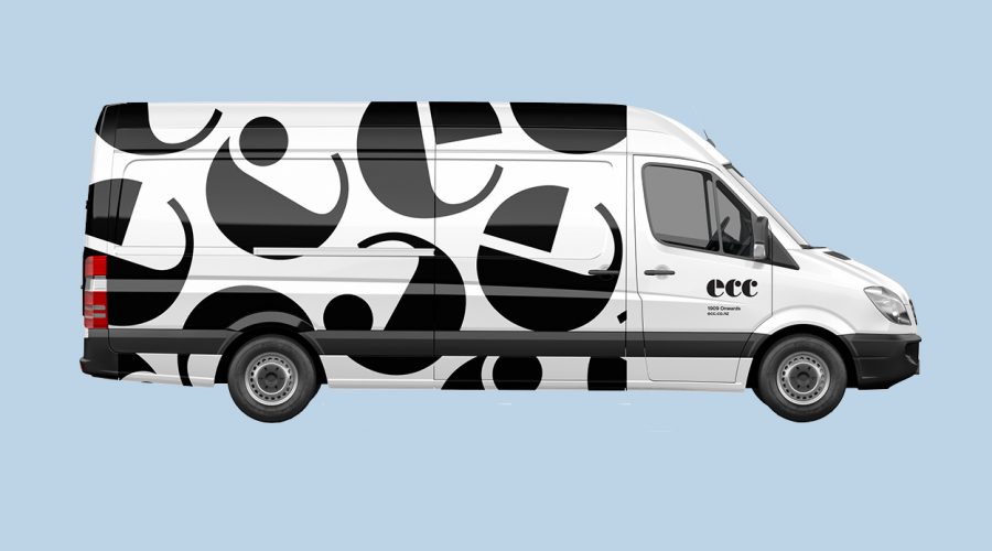
There becomes a shorthand way of working, a mutual understanding of the process and the expectations. It also allows you to try stuff you may not have otherwise. We’ve worked with the inimitable Thorburns — Mike and now son Richard at ECC since we rebranded them in 2006, and fifteen years later we’re pushing the original logo around in a new and playful way. That’s pretty cool.
4. Keep it simple
Simplicity; clarity; integrity; honesty, are inherent in our approach to graphic design. We like to take a reductive approach to a task or brief — we like simple, but not simplistic solutions. ‘To distill something to its essence, the essential’ is a modernist ideal that still rings true but we don’t believe there should be a total lack of emotion or sentimentality in the work. We talk a lot about successful work having ‘spirit’ — an enigmatic quality, an energy.
5. Ask questions
There’s a joke that we designers like…
Q. How many designers does it take to change a lightbulb?
A. Does it have to be a lightbulb?
As designers, we are hard-wired to find efficient solutions to any given problem or brief. But at the early, investigative phase of the project, it’s best to ask a heap of questions. It’s how we are going to unravel the complex, and try and simplify it.
6. Can we find new forms?
It’s a popular misconception that graphic designers just ‘love’ what they do, that it’s all fun and games — like a hobby. This can be true of parts of the process but it’s simply not the case for me. It’s hard work; it takes relentless effort; we are continually tasked with finding a new way at something — to present something that hasn’t been seen before. I’m not sure that’s even entirely possible in today’s world where we overdose on visual communication.
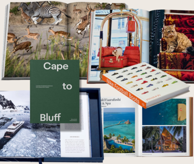
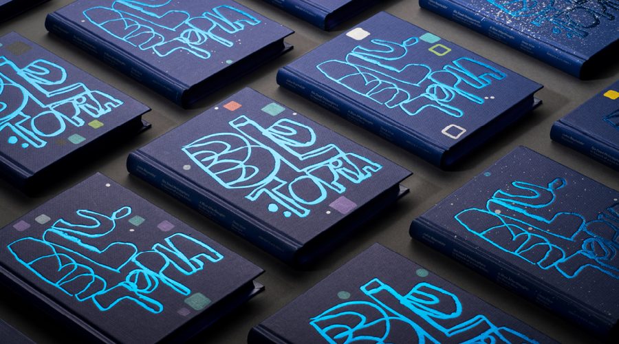
The desire to find new forms is why I enjoy working with John Reynolds. His signature handwriting and energetic mark-marking, rambling and bristling demands to sit centre stage within any given output because it is unquestionably its own thing. The book we made together, Blutopia has unique covers hand-painted by John, so no two are alike, a looping visual schema of over-drawing and painterly play.
7. Never stop designing
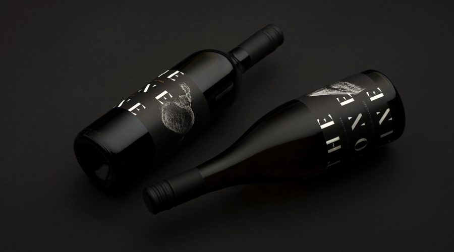
We’ve been discussing this a lot in the studio lately. The importance of pushing and making changes to the work, even late into the job, is never off the table. One of my favourite Inhouse projects was for a new wine brand in the Waipara Valley. We helped name The Boneline in reference to the nearby K—T Boundary line that defines the extinction of the dinosaurs. Up the valley, it’s Canterbury Gothic; shadowy hills and murky corners. We had a great rapport with the client, a compelling story and had produced some beautiful visual assets.
All the stars had aligned but late in the process we thought the work could be better. We made a simple but significant change — a dramatic scale shift had an activating effect and everything fell into place. Like it was always meant to be this way.
8. Love print
We believe the role of print in people’s lives is changing as part of a reaction against being continually online and connected. The increasing need to take time out from screens means the role of print is becoming more valuable. We have more books on the books than ever. While our print work has certainly diminished, there’s almost an obligation to make the work that is printed, a bit special. Corporate stationery is practically obsolete now. The business card is sometimes the only artefact so we like to get all American Psycho on those.
9. Make stuff to last
After a few years working in Wellington advertising agencies, I developed a love for moving type around. It was physical, mechanical work; adjusting type sizes on a bromide camera or Letrasetting a headline. Back then everything went to print and even the artwork itself was a physical thing. With the world becoming increasingly digital, we’ve had to adapt and learn new designing methods for this media. They all present new opportunities but you can’t escape the fact that you’re trapped in the flat visual plane of a screen.
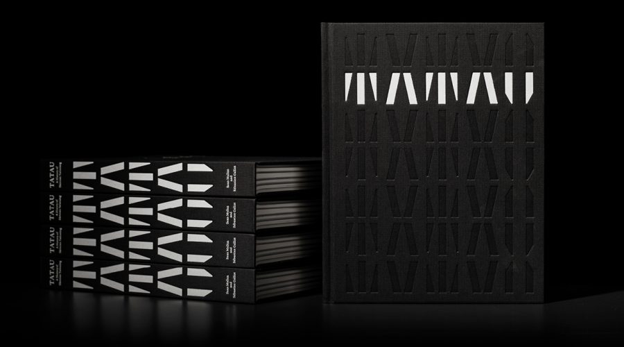
So making things that live in the physical world, like books is really important to us. We love designing books, especially ones that contribute to the understanding of the culture. We love that they tend to stick around and have an ongoing impact. But we also believe that in general, good design lasts, well-designed things tend to be kept and are less likely to be replaced or redesigned.
10. Help the aged
I spent a lot of my early career typesetting blocks of text in 5-6 pt. Tiny. I loved the way it looked on the page. For this, I now apologise. My defective visual perception i.e. deteriorating eyesight, has afforded me empathy with those who suggested I increase the point size. I was recently revisiting a book I’d designed back in 2006, and you were right — it’s fucking hard to read (sorry). Current design work is now reassuringly readable.
11. Have the right amount of wrong
Graphic design doesn’t always have to be beautiful. I like work that can appear a little awkward, a little off. Something that makes you look twice. It could have something to do with an odd scale shift, something off-balance, or just a super-fruity typeface.
12. Obsess about other stuff
Being a graphic designer and running a short deadline-driven practice means a lot of time at the studio, and a lot of time on the computer and a lot of fucking emails. So it’s imperative to have some design projects off the computer and unrelated to Inhouse work. Over the last couple of years, I’ve gotten a bit obsessive about designing and planting native gardens.
About three years ago, we returned to our Inhouse roots, relocating from a downtown Britomart warehouse to the leafy suburb of Birkenhead Point. A humble 60’s structure situated high in the canopy of established native bush backing on to Le Roy’s Reserve. I have been re-wilding the back and turning the old front lawn and entrance into a Japanese-inspired native garden. Such pleasure in exchanging fonts for flora, the garden is the slowest design project I’ve undertaken — there will be flower cycles and trees that will display spectacular transformational performance. And creating a little zen-like haven for the studio has acted as an antidote to the studio’s daily demands.
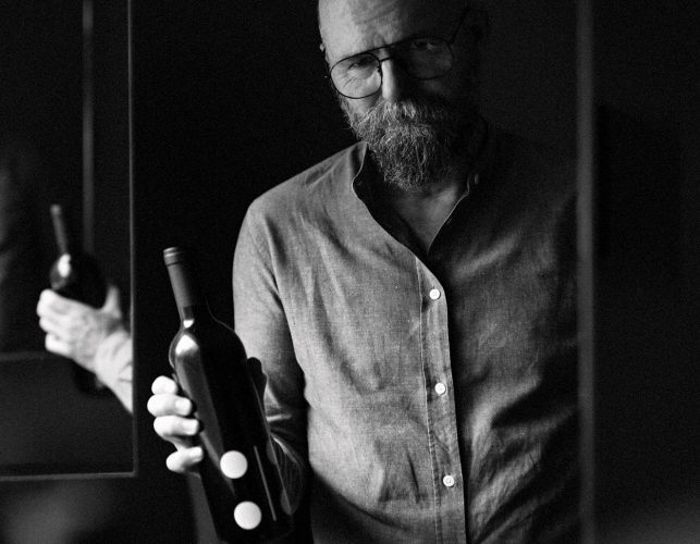
13. Take a look in the mirror
I have a curious habit of reviewing work in front of the mirror. I’ve done it since university days. I’ll take a mocked-up book cover, bottle of wine, whatever, and assess its reflection. Seeing it in mirror-image somehow highlights imperfections in much the same way that inspecting type kerning by looking at a printout upside down does. You can also observe how your ‘whatever it is’ looks in the hand and whether your bum looks big with it.