Art direction — Amber Armitage/ Marigold
Photography — Melanie Jenkins/ Flash Studios
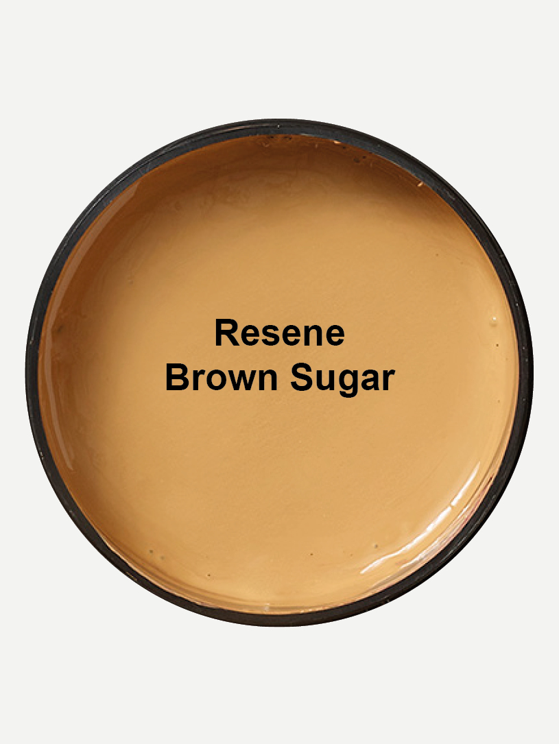
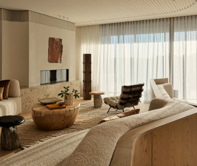
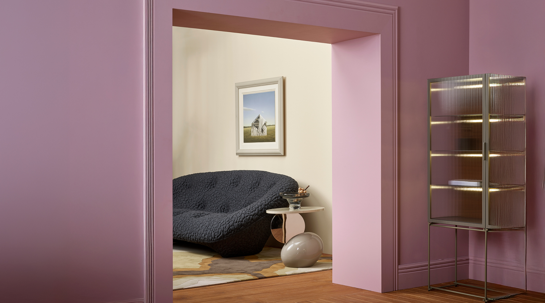
When it comes to refreshing our homes, colour is one of the simplest yet most impactful ways to shift a space’s atmosphere — and this alluring palette proves it. Romantic without being saccharine, modern yet anchored in heritage, this rich base of muted plum and soft caramel weaves together tones that feel both nostalgic and fresh. These shades, when combined, create a grounding foundation of warmth and understated elegance.
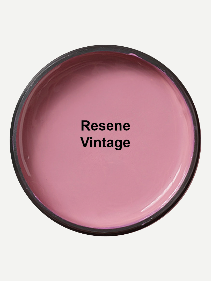
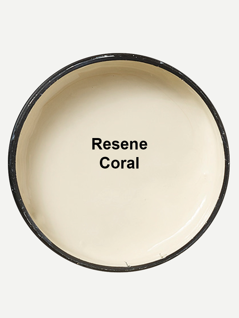
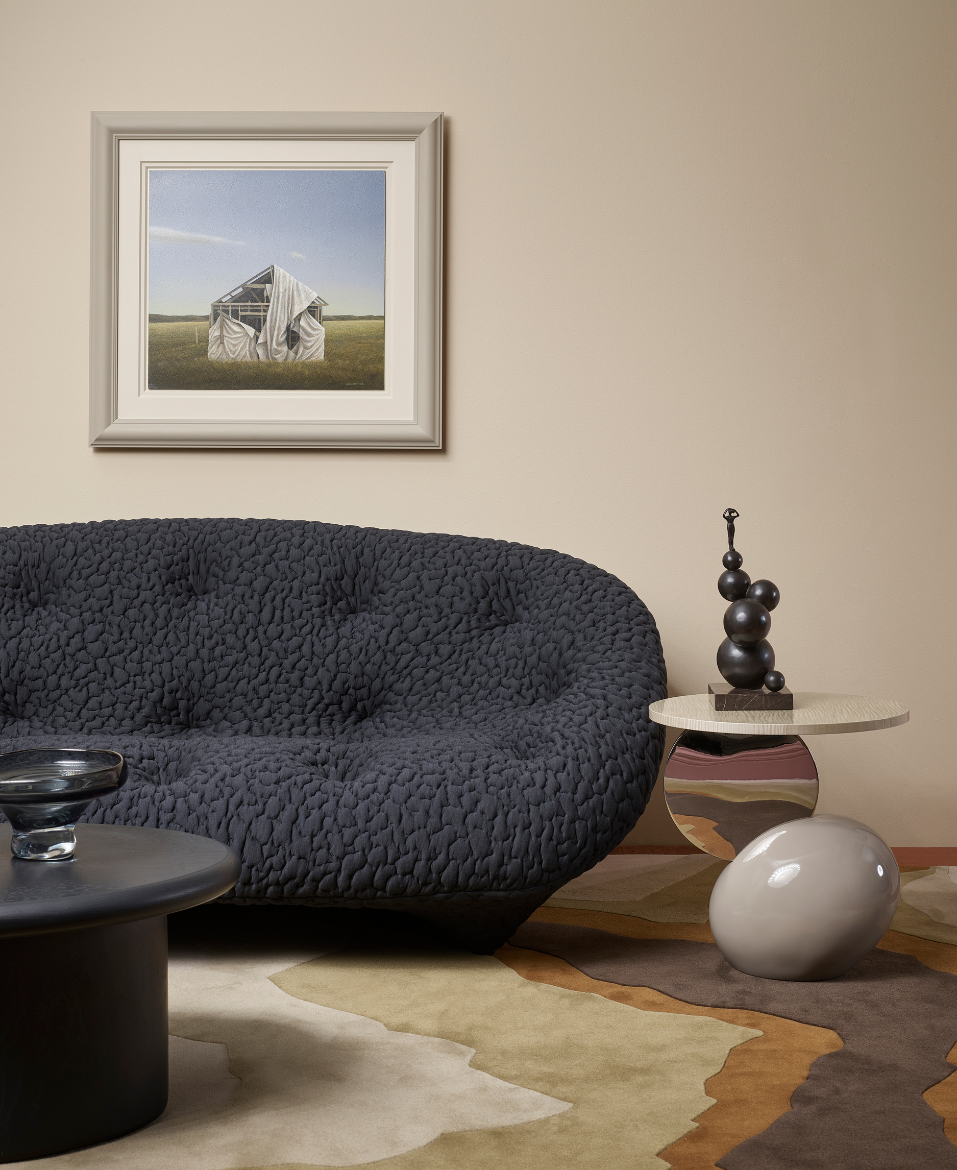
Here, Resene Vintage takes centre stage, offering that dusty mauve-meets-plum note. Offset against Resene Coral in an adjoining room, the caramel undertone amplifies the purple’s subtle richness, bringing out the palette’s quietly dramatic character. Together, they strike a balance that’s indulgent without being overwhelming, ideal for living spaces that invite comfort while still feeling elevated.
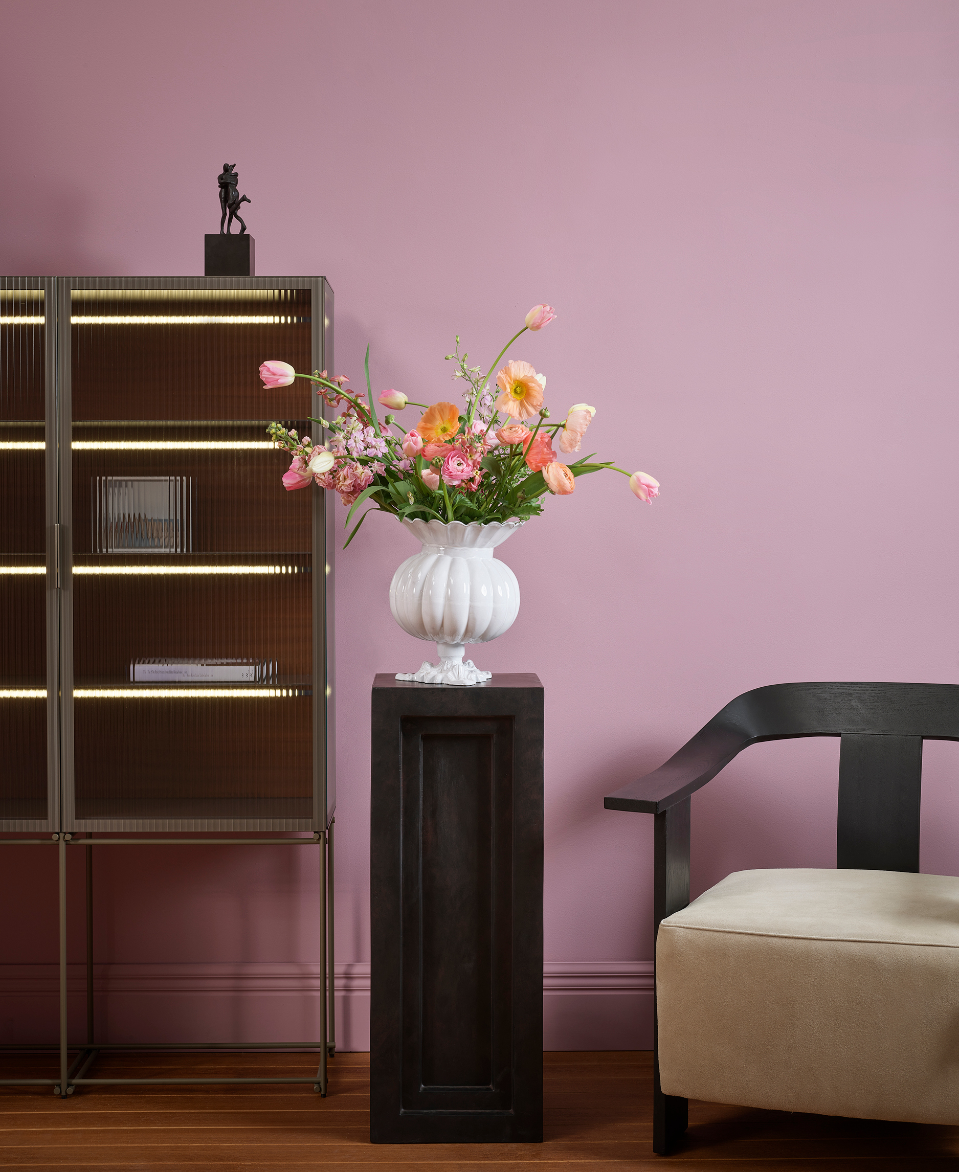
To keep the look contemporary, lean into unexpected accents and artistic touches. For moments of bold punctuation, deep black provides the perfect grounding contrast, sharpening the softer tones with a sense of graphic definition. Texture, too, has its part to play. From polished metals and natural woods to plush soft furnishings, layered materials elevate the scheme with tactile interest.
The key, however, lies in layering. Let bolder hues breathe across walls or upholstery, anchor the room with caramel or ochre elements, and introduce accent shades sparingly for emphasis. The result is a space that feels curated, characterful, and deeply personal.
More than a passing trend, this palette speaks to a wider shift in interiors where personality is favoured over austerity, made effortlessly achievable with Resene’s considered palette.